We’re getting closer to the publication of my next novel, Is There Life After College?, and the cover is ready. First, a little background info. This book is actually a combination of two novellas I wrote in the late ‘90s, which explains why it’s my longest novel. Fortunately for me, the second novella picks up only a few months after the first one, but the tones are quite different from each other. This is why I split up the novel into two parts, named after the two protagonists: Mark and Astra. (The sequel to Is There Life After College? was simply titled Astra.) The first part is a whimsical adventure that mostly takes place in New York City, and the second part is much darker and covers the consequences of that adventure.
Here is the cover I drew for the novella version of Is There Life After College?
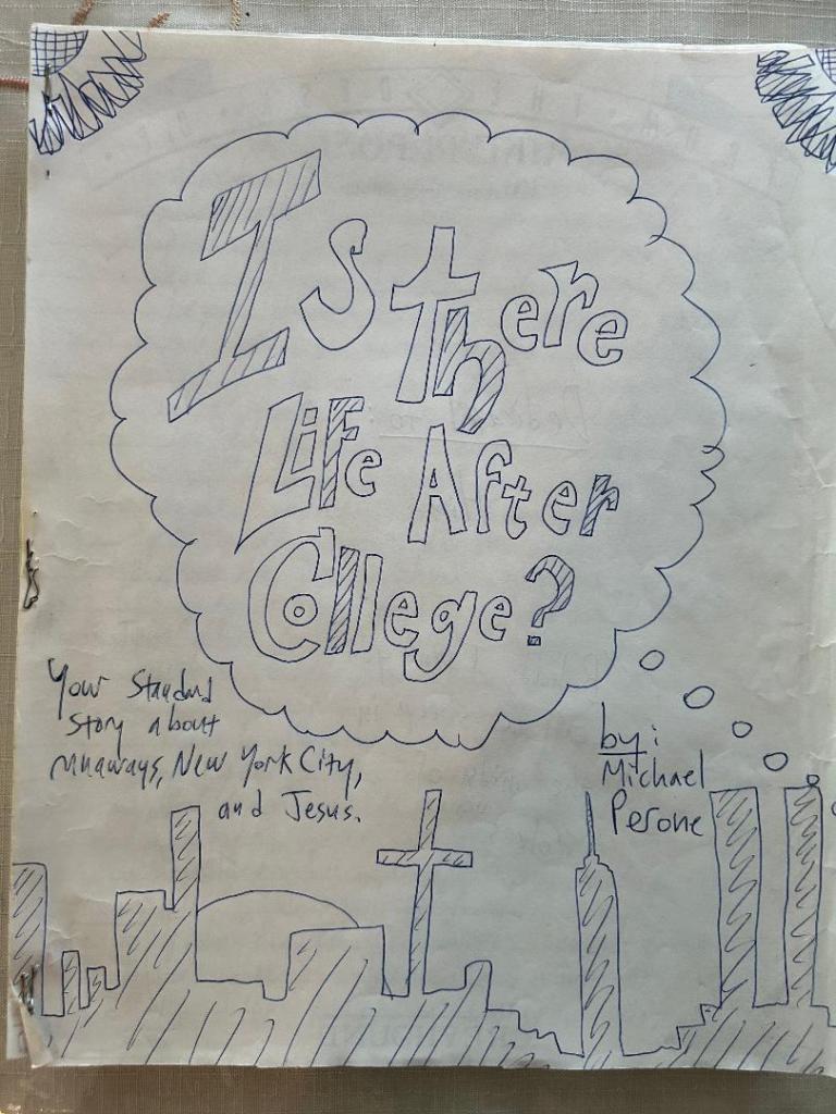
You’ll notice there’s a cross in the New York City skyline, because religion—and Christianity, in particular—is a subject that comes up a lot in the conversations between the two main characters/love interests. I decided not to go with this cover design because I felt the religious symbol might turn some people off. (After all, not everyone is Christian.) You’ll also notice that I put the Twin Towers on the cover. Again, I wrote this story in the late ‘90s, before 9/11. Though the full-length novel version of Is There Life After College? takes place in the late ‘90s as well when the towers were still standing, I didn’t want to include them because not only did I feel that would be distracting, I didn’t want to remind people of one of our country’s greatest tragedies. Also, that event and the Twin Towers in general don’t come into play in the story at all.
Here is the cover I drew for the novella version of Astra:
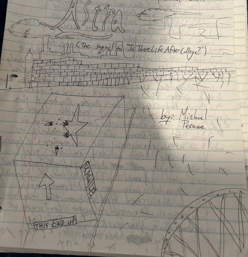
I thought this was a better image. It’s more interesting and almost requires you to figure out what’s going on. Why is there a broken star on top of the box? Whose box is it? And why is the word “FRAGILE” written on the side? Needless to say, there’s a lot of symbolism going on in this cover, but to understand it, you have to read the book. You’ll also notice I still included the Manhattan skyline in the background—or at least a fuzzy approximation of it. And btw, that’s supposed to be a wastepaper basket in the bottom right corner. I’m not a very good artist.
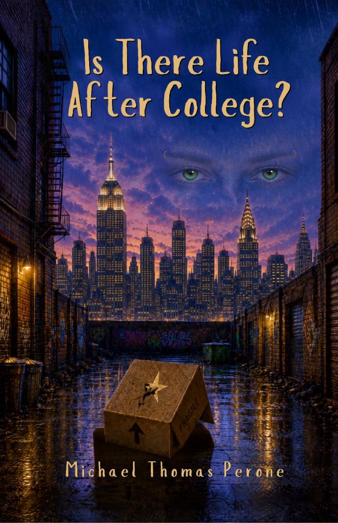
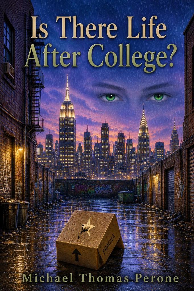
I sent the last cover to my new publisher with a few notes and add-ons, and this is what they came up with:
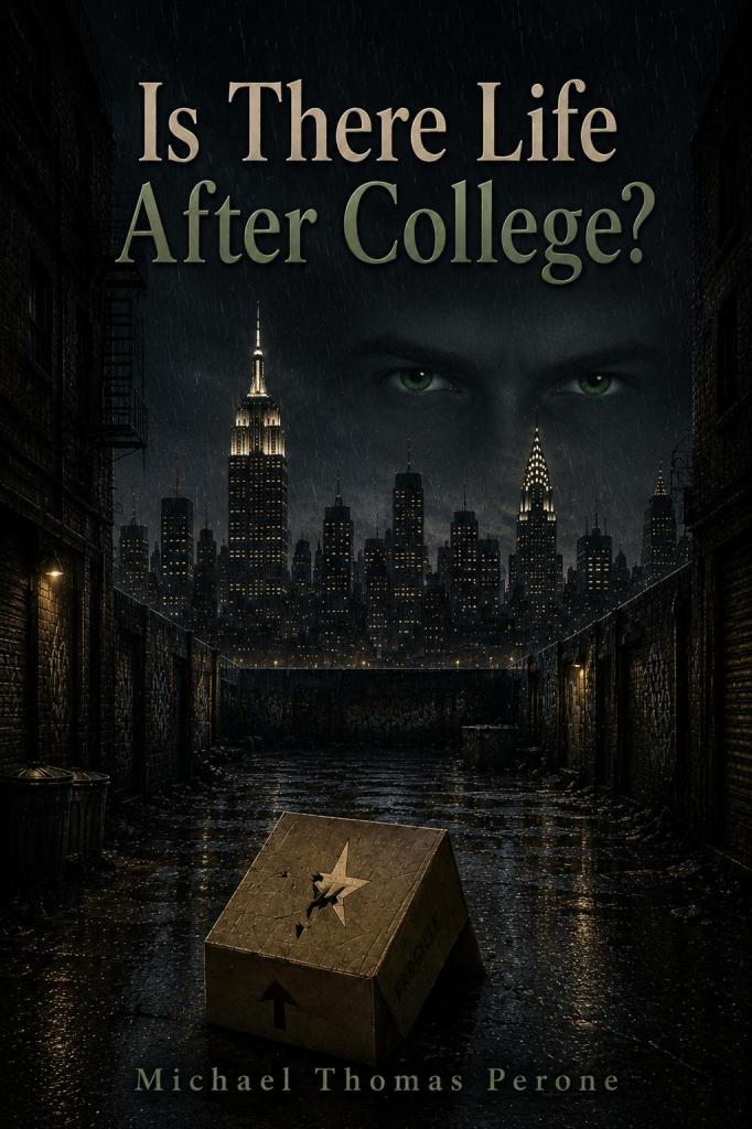
You can see I stole the idea of floating eyes from the cover of The Great Gatsby, which my fellow author friend explained to me was based on a piece of art that F. Scott Fitzgerald saw, and he fell in love with it and insisted it be incorporated into his cover. As you can probably guess, those green eyes belong to Astra, the female lead. And speaking of color, I felt the colors of this cover were way too drab and dreary. Yes, there’s lots of drama in this book, but as the late, great David Foster Wallace said about his over 1,000-paged novel Infinite Jest, “It’s not an unfun book.” So I told my publisher to brighten it up a bit and also enlarge my name a little. (Hey, I’m only human.) Also, for those with sharp eyes, you’ll notice they spelled “FRAGILE” wrong. Maybe the cover designer is friends with Ralphie’s Old Man (always capitalized, out of respect) from A Christmas Story: “‘Frah-gee-lay.’ That must be Italian!” Anyway, I sent these revisions to my publisher, and this is what they sent back:
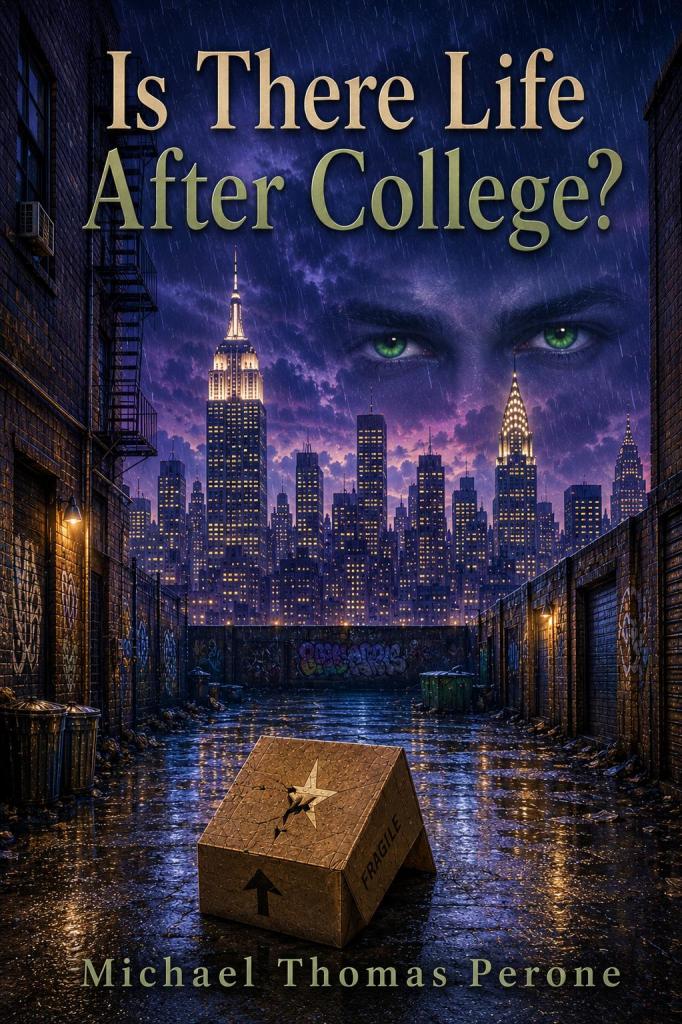
Much better. Now this is a book I would read! However, I felt Astra’s eyebrows were a little too large and not feminine enough. I didn’t want them to be pencil lines, but I felt they should be a little thinner to immediately convey to the reader that yes, this is a girl’s eyes. I also thought the cover’s colors could be slightly lighter. Here is what I got back:
We’re getting close! After examining this cover, I realized that Astra is missing her eyebrow rings, so to make it book accurate, I asked my publisher to add them. Also, after showing the cover to a few people, they noted that the title’s font looks too academic, and it doesn’t help that the title itself sounds like this is a nonfiction book about getting a job after graduating college, so I told my publisher to make the font look more like someone writing a diary entry. Also, I wasn’t crazy about the gold melding into the green to match the eyes, so I requested the title be solid gold, like those ‘80s T.V. dancers, and this is what they sent back to me:

Ta-da! That’s the final cover. That aforementioned author friend told me she felt the cover looked a little too much like sci-fi with the floating eyes, but I reminded her that the same technique was used for The Great Gatsby, which obviously isn’t science fiction. Now there were many different variations of the covers I didn’t show you here (e.g., the eyebrow rings were originally silver, but I changed them to gold to match the lights of the skyline), but I didn’t want this blog to be endless, so these were just the highlights.
That’s it! Now you know the ins and outs of cover design. And knowing is half the—oh, I’m not going to say it anymore.
***
In other MTP news, as part of The Electric God and Other Shorts winning Distinguished Favorite at The 2025 NYC Big Book Awards, book marketer Brian Feinblum interviewed me for his award-winning book blog Book Marketing Buzz Blog. You can read the interview here:
***
In other, other MTP news, here’s a pic of my first Barnes & Noble book signing that took place last month:
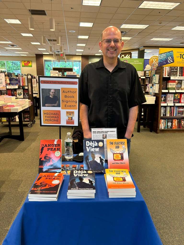
So, after 4 years of trying, was it worth the wait of getting a B&N signing? Um…ask me later! Seriously, thanks to my family who came out, even though you guys already had copies of my books.
MTP
P.S.: Battle. Knowing is half the battle. (I just couldn’t help myself.)
P.P.S.: The Danger Peak audiobook is now available!
P.P.P.S.: The new edition of The Electric God and Other Shorts is available on Amazon and Barnes & Noble:
