Well, I wrote photo essays for Danger Peak and Déjà View, my first two books, so I suppose I have to do it with my latest (and last?), The Electric God and Other Shorts. Here you will see the various covers I came up with as a teen and young adult when I originally wrote these stories and several versions of the final cover designed by my publisher (with my input, of course). Here we go!
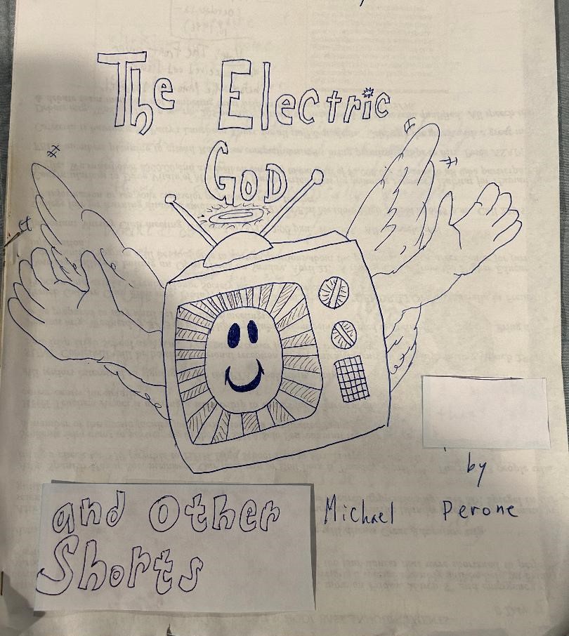
Here is the original cover I created for The Electric God when I first wrote the story way back in the ‘90s (or you can just glance at the top of this blog):

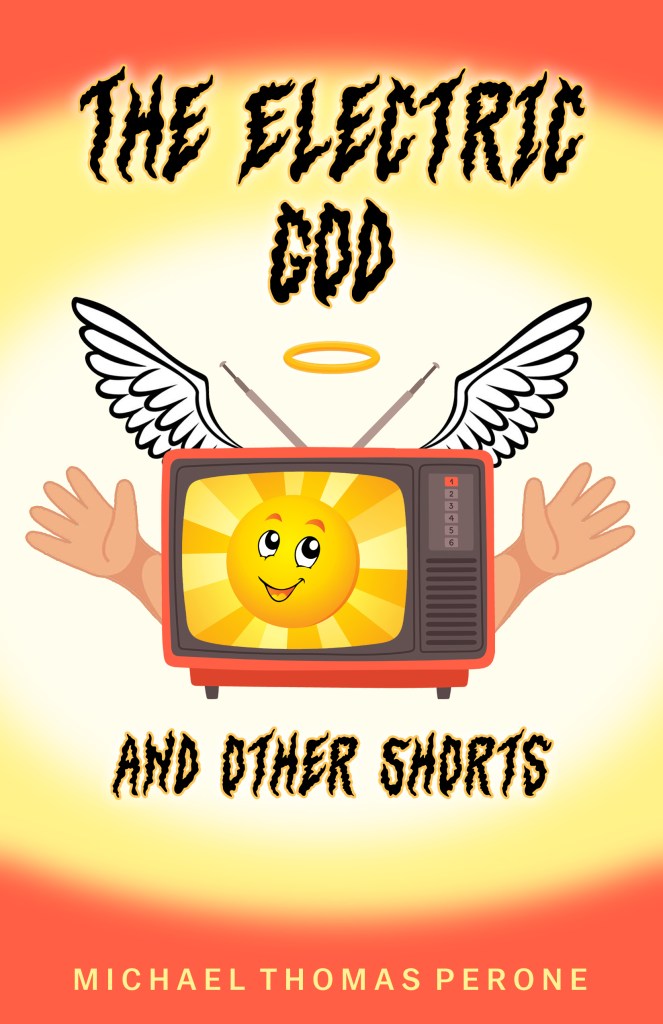
As you can see, I was going for a creepy-dark vibe, as if the television isn’t getting closer to embrace you but rather suffocate you. (Metaphors!) When I passed this design to my publisher, here is what they came back with:

Wow, that is decidedly not dark, though it remains creepy—but in the goofy, wrong kind of way. I immediately decided to remove the cartoony face as it makes the book appear as if it’s for children. If you’ve read the book already (and if so, you’re a fast reader!), you’ll know that this book is definitely not for little kids. I also didn’t like the bright rays of light emanating from the T.V. set, as it was headache-inducing (at least to me). So I asked my publisher to remove the light rays and replace the cartoony face with a sun sporting a smiley face, and this is what they came up with:
At this point, I realized the smiley face gimmick just wasn’t going to work, so I deep-sixed the face but kept the sun. I also thought the arms outstretching from the T.V. set just looked wrong, so I asked them to axe those as well, and this is what my publisher brought back to me:

Much better, but I still thought the colors were too bright. It also looked like a nuclear bomb was going off in the background, so I asked my publisher to soften it. This is what they gave me:
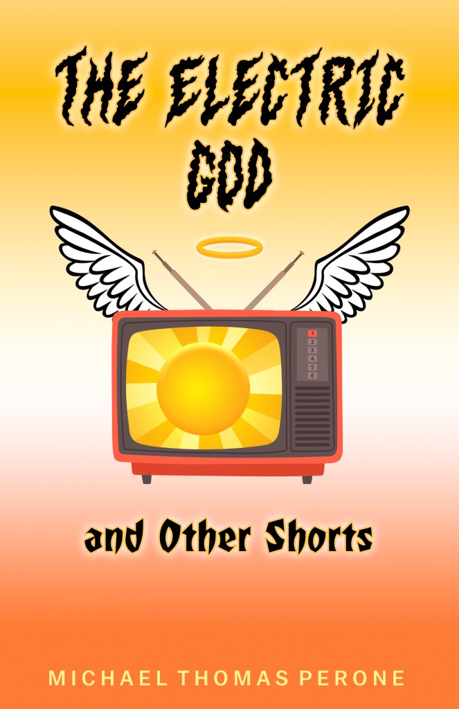
At last, we achieved our final cover for The Electric God and Other Shorts. It’s pretty, ain’t it? There were actually other versions of the cover in between the ones above showing even subtler differences, but I didn’t want to bore you or fill this blog with 10 different covers.
Now I’m going to go in order of the stories that appear in the book. You can see my rendering of the “cover” for How to Save a Drowning Butterfly below.

I like the balloon font, something I hardly ever use. The rest is just a simple drawing of the story’s opening scene featuring the titular butterfly.
The next cover, for Paper Language, is a little different, as it was a two-story collection I wrote back in the day. The other story, titled Da Goodz, was about a teenaged nerd trying to win over the high school bully by doing favors for him around town—some of them illegal. Of course, he learns in the end to believe in himself and dump his chump of a “friend.” This story almost made the cut of the book, but I cut it (ha!) because there was nothing supernatural about it (almost every story in The Electric God and Other Shorts has something supernatural going on), and truth be told, it wasn’t all that interesting. Anyway, here it is:
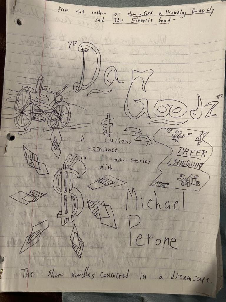
That squiggly drawing on the left side of the page is supposed to be a bicycle. I like how I wrote “From the author of How to Save a Drowning Butterfly and The Electric God” at the top of the page. Little did I know that I would one day combine those stories and Paper Language into its own book over 25 years later. Also, apparently, according to the short note written at the bottom of the page, I came up with these stories in a series of dreams. I would’ve never remembered that had I not written it down.
The next cover, for Investigating the Future’s End, is probably my favorite of the bunch, though The Electric God might beat it just because of the simplicity of its design. Let’s put it this way; it took the longest to draw this next cover.

That snake-like thing on the right side of the page is supposed to be a bent streetlight, melting in the heat of the fire. And for those wondering about the freakish, limbless baby, well, IYKYK.
The next cover, for The Shovel, is as dark as the story. I purposefully put the main character, whose name we never learn, into almost a superhero stance, though, of course, if you read the story, you know he’s more of an antihero. Here it is:

I like the story’s tagline at the top of the page: “Who says madness is inborn?” It really sums up the theme of the story (and practically the entire book The Electric God and Other Shorts). In fact, I liked it so much, I included it in the story’s Author Note in the book. I also love how this is the second cover in a row featuring my terrible interpretation of streetlamps.
The last cover, for School Spirit, was actually for a short story simply titled Spirit, but I decided to change it for the book because it was a little too simple. Here it is:

I like the little pumpkin on the porch of the house (though it’s hard to see), indicating that the story takes place around Halloween. (I kept that aspect of the story when I updated it for the book.) I also like the tagline at the top of the page: “Never open the door to the house of bad dreams…,” though, unlike for The Shovel, I don’t mention it in the book version. (See what neat tidbits you learn from these blogs?)
And speaking of The Shovel, here was the original chapter design I made for that story when I first wrote it:

I would’ve kept that design throughout the book if it was named after this story. Instead, I went with The Electric God since I prefer that title (and story) more. And speaking of which, you can see the original electrified title design of The Electric God I drew below:

Finally, here is the chapter design I came up with to use throughout the book. Instead of little shovels, we used little old-school T.V. sets.

And here is the final chapter design my publisher came up with:

Now, in order to have the top image of this blog post on social media when I share it, I’m going to repost the original drawing of The Electric God below. (Otherwise, the above chapter design is going to be the one posted when I share the blog on social media, as WordPress always posts the last pic in your blog when you share it, for some confounded reason.) Sorry you’re going to see this three times:

That’s about it. Whew! Those are a lot of drawings. I would say my hands are tired, but I drew most of these designs decades ago when being an author was just a figment of Little Mikey’s imagination. It seems dreams do (at least sometimes) come true, so thank all of you for helping me realize those dreams.
***
In other MTP news, The Electric God and Other Shorts is in the middle of a blog tour, courtesy of Rockstar Book Tours. Here is what has been posted so far:
I’ll be back next week with the rest of the tour’s posts, as well as wrapping up the highs (interview!) and lows (bloggers forgetting to post!) of this particular blog tour.
MTP
P.S.: For those who don’t know, The Electric God and Other Shorts is about sane people struggling to survive an insane world. Just thought I’d throw that out there this week. Seemed relevant.
P.P.S.: Next week’s blog: The End of the Tour (Part II)
P.P.P.S.: The Electric God and Other Shorts is now available on Amazon and Barnes & Noble:

One response to “The Electric God and Other Shorts Photo Essay”
[…] The Electric God and Other Shorts Photo Essay […]
LikeLike